Introduction
The way websites are designed has changed significantly over the years. Earlier, designers relied heavily on fixed pixel values to control layout and structure. However, with the rise of multiple devices and screen sizes, this approach started creating limitations. This is where pxless design comes into the picture.
Pxless is not just a technical term; it represents a modern mindset in web development that focuses on flexibility, responsiveness, and user experience. In this article, you will get a complete understanding of pxless, how it works, and why it is becoming essential in today’s digital world.
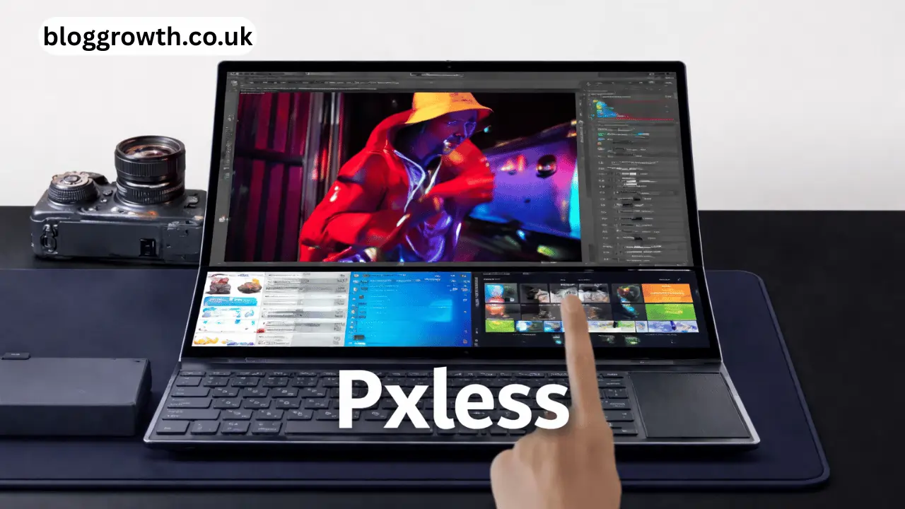
What is Pxless?
Pxless refers to a design approach where fixed pixel units are avoided, and flexible units are used instead. These units include percentages, rem, em, viewport width (vw), and viewport height (vh).
In traditional design, elements are defined using fixed values like 1000px width or 16px font size. In pxless design, these values are replaced with scalable units so that the layout can adjust automatically based on screen size and user settings.
The main idea behind pxless is simple: instead of forcing a design to stay the same on every screen, allow it to adapt naturally.
Why Pxless is Important Today
Modern users access websites from a wide range of devices including smartphones, tablets, laptops, and large screens. Fixed pixel layouts often fail to provide a consistent experience across these devices.
Pxless solves this problem by making layouts flexible and adaptive.
Better Device Compatibility
A pxless layout works smoothly on different screen sizes without breaking the structure. This ensures that users get a consistent experience no matter what device they are using.
Improved User Experience
When content adjusts properly to the screen, it becomes easier to read and navigate. Pxless helps create a smooth and user-friendly interface.
Accessibility Support
Pxless design supports zooming and user-defined font sizes. This makes websites more accessible for users with different needs.
Core Principles of Pxless Design
Understanding the main principles of pxless helps in applying it effectively in real projects.
Fluid Layouts
In pxless design, layouts are not fixed. They expand and shrink depending on the screen size. This is usually achieved using percentage-based widths or flexible grids.
Use of Relative Units
Instead of pixels, pxless uses units like rem and em. These units scale based on the root font size, making the design consistent and flexible.
Content-Driven Structure
Pxless focuses on content first. Instead of adjusting content to fit into a fixed layout, the layout is designed to fit the content.
Built-in Responsiveness
Pxless design reduces the need for multiple breakpoints. The layout automatically adapts, making it responsive by default.
Pxless vs Pixel-Based Design
To understand the value of pxless, it is important to compare it with traditional pixel-based design.
Pixel-Based Design
Pixel-based design uses fixed dimensions. While it provides precise control, it lacks flexibility and often breaks on different devices.
Pxless Design
Pxless design is flexible and scalable. It adjusts automatically, making it suitable for modern web environments.
The key difference is that pixel-based design focuses on control, while pxless focuses on adaptability.
Benefits of Using Pxless
There are several advantages of adopting pxless in web design and development.
Consistent User Experience
Users get a uniform experience across all devices. The layout adjusts without losing structure or readability.
SEO Advantages
Search engines prefer websites that are mobile-friendly and responsive. Pxless helps meet these requirements, which can improve search rankings.
Future-Ready Design
With new devices constantly entering the market, pxless ensures that your design remains functional without major changes.
Easier Maintenance
Since pxless reduces dependency on fixed values, developers spend less time fixing layout issues.
Better Accessibility
Users can adjust font sizes or zoom levels without breaking the design. This makes pxless an inclusive approach.
How to Implement Pxless in Your Projects
Switching to pxless does not require starting from scratch. You can gradually move from pixel-based design to a flexible approach.
Replace Pixel Units
Start replacing pixel values with relative units like rem for fonts and percentages for layout widths.
Use Flexible Layout Systems
CSS Flexbox and Grid are powerful tools that support pxless design. They allow elements to adjust dynamically.
Avoid Fixed Heights and Widths
Let content define the size of elements instead of using strict pixel values.
Test Responsiveness
Always test your design on different devices to ensure it works properly in all situations.
Common Misunderstandings About Pxless
There are some misconceptions that often confuse beginners.
Pxless Means No Design Control
This is not true. Pxless still allows control, but in a more flexible way.
Pxless is Difficult to Learn
Anyone with basic CSS knowledge can start using pxless. It only requires a shift in thinking.
Pixel Design is Always Better
Pixel-perfect design may look accurate on one screen but often fails on others. Pxless offers a more practical solution.
Other Meanings of Pxless
The term pxless is not limited to design. It is also used in different contexts, which can be useful for content creators.
Digital Tools and Platforms
Some tools use the name pxless for productivity and automation solutions.
Website Builders
Pxless can also refer to platforms that allow users to create responsive websites without relying on fixed pixel values.
This makes pxless a versatile keyword with multiple content opportunities.
The Future of Pxless in Web Design
The demand for flexible and responsive design is increasing every day. As technology evolves, users expect websites to work seamlessly on all devices.
Pxless aligns perfectly with these expectations. It allows developers to create designs that are adaptable, scalable, and user-friendly.
In the future, pxless is likely to become a standard approach rather than an option.
Conclusion
Pxless is changing the way websites are designed. By moving away from fixed pixel values and focusing on flexibility, it creates better user experiences and more adaptable designs.
For developers and designers, adopting pxless is a smart step toward building modern, efficient, and future-ready websites. As digital trends continue to evolve, pxless will play a key role in shaping the future of web development.
FAQs
1. What is pxless in simple terms?
Pxless is a design approach that avoids fixed pixel values and uses flexible units to create responsive layouts.
2. Why is pxless important for modern websites?
Pxless ensures that websites work smoothly across different devices and screen sizes.
3. Can beginners learn pxless easily?
Yes, beginners can learn pxless by understanding basic CSS units and practicing flexible layouts.
4. Does pxless improve website performance?
Pxless improves user experience and responsiveness, which can indirectly enhance overall performance.
5. Is pxless better than traditional pixel design?
Pxless is better for modern needs because it offers flexibility, scalability, and improved usability.
You May Also Read: Plftiger: Smart Digital Framework for Automation, Security and Workflows